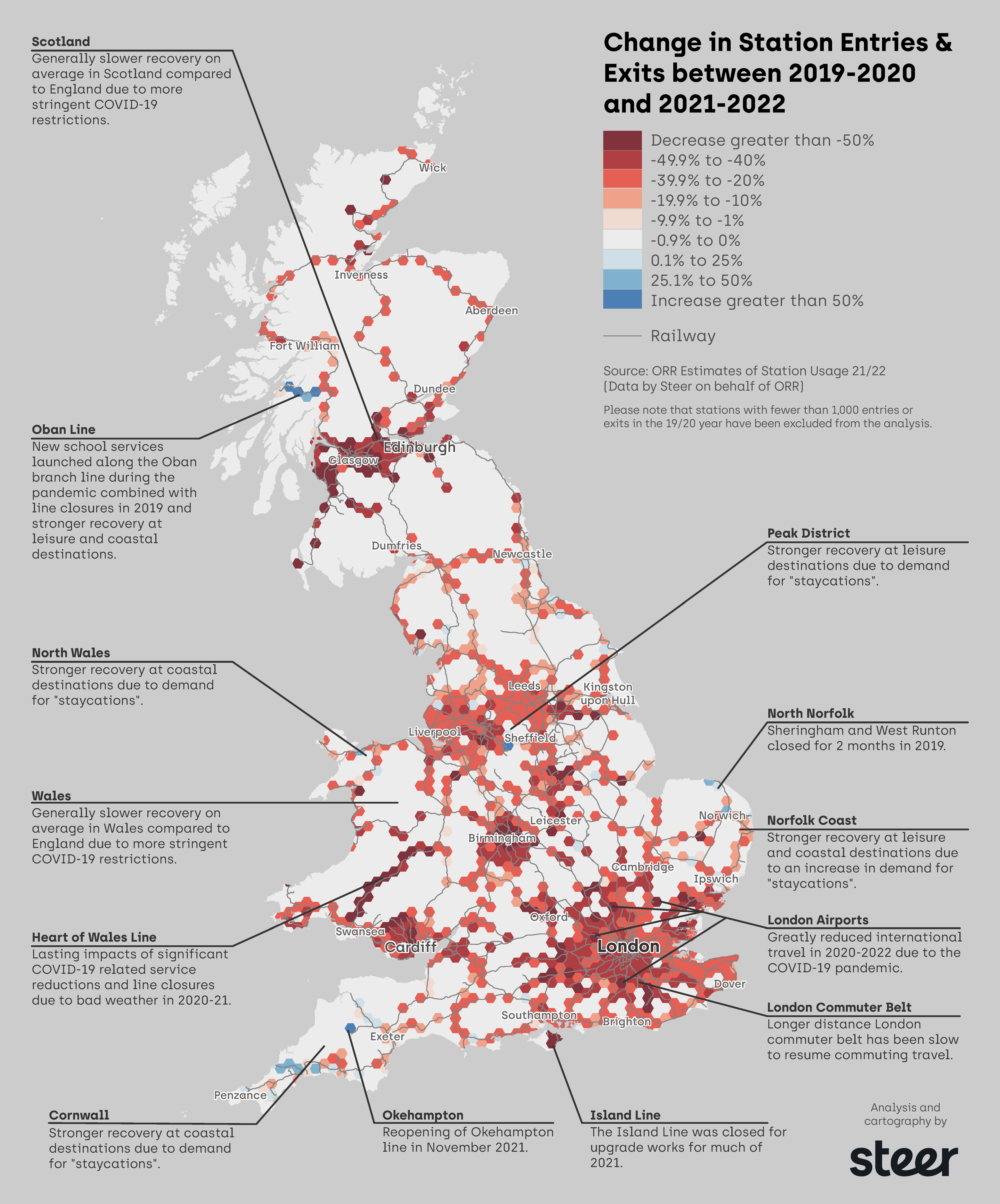
It's great to have data for a particular snapshot of time, but what makes things even more interesting is to compare that data with previous time periods and look for trends or stories within that information.
We do this a lot at Steer, whether it be with Census data, travel to work surveys, or the latest ORR Estimates of Station Usage released at the end of November 2022. Rather than just seeing what's happening now, we are able to compare with previous (pre-covid in this case) data and identify trends and maybe learn lessons on what's worked well and what still needs addressing.
Our Steer Rail team have been producing these estimates on behalf of the ORR (The Office of Rail and Road) for over a decade, and asked us if we could produce something for the recent #30DayMapChallenge - we love a map, so obviously we jumped at that opportunity!
The density of data, particularly in Central Scotland, the North-West, the Midlands, and London, meant that we wouldn't be able to see the changes per station easily as a snapshot of mainland Britain, so a hexcell grid was overlaid to help us see what was happening in the different regions more easily.
Since our #30DayMapChallenge version we have been able to review further and look for these trends and reasons why certain areas have changed. To highlight the most significant trends, our latest version has excluded locations where fewer than 1,000 entries or exits in 2019/2020 occurred. This has left us with 13 key locations that we have identified as having an interesting story to tell.
If you have a large dataset and don't know where to start - why don't you ask us to map it and see what trends come out of it?
Contact Clare Seldon, Lead Cartographer or Andrew Davies from our Rail team at Steer.


